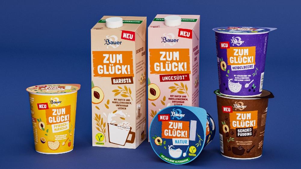
“What sets Bauer ‘ZUM GLÜCK!’ apart is the combination of great taste and special sustainability aspects, as consumers have confirmed to us in numerous studies. These new drinks, yoghurt substitutes, and plant-based puddings are a positive solution to a category deficit,” said Frank Mayerhofer, director of marketing and innovation.
Targeted further development of venerable design features
The master designs for both products lines, “Der Große Bauer” and “ZUM GLÜCK!”, were developed by Peter Schmidt Group. The team of designers headed by executive creative director Inga Wolter freed the logo from the dark blue circle that previously surrounded it, thereby imparting a new lightness to the brand appearance. The old-fashioned German B is reiterated subtly, like a watermark, to emphasize the long tradition and premium quality of the family-owned business while also reminding consumers of the creamy taste.
Inga Wolter is confident Bauer is taking the right step at the right time. “Traditional brands need to evolve in order to remain true to themselves,” she said. “Bauer recognizes that the values they and their products have stood for for years are decoded differently by younger target groups. Both the familiar classic ‘Der Große Bauer’ and the new ‘ZUM GLÜCK!’ brand reflect a modern understanding of naturalness, honesty and authenticity.”
The products from “ZUM GLÜCK!” stand out in the growing market segment of milk substitutes. The brand colors and the consciously imperfect lettering set against an orange background are eye-catching. Playful illustrations and a relaxed, open-minded tone give the packaging the informality that the target group also wants for everyday life – a slice of joie de vivre they can enjoy with a clear conscience.
Successful market launch thanks to teamwork across different agencies
For the market launch of “Der Große Bauer” the company also decided to work with another agency from Frankfurt. Called M.I.L.K., the agency specializes in packaging design for the food sector. They translated the master design created by Peter Schmidt Group onto the packaging of the individual varieties, which adhere to the brand’s “value-added strategy” by offering attractive options such as cereal, müsli, crunchy chips, seasonal, exotic and extra fruit. The launch was accompanied by a communication campaign with the headline, „So lecker wie immer. So schön wie nie.” (As delicious as always. More attractive than ever) Developed by BBDO Düsseldorf, the campaign was implemented in out-of-home, radio, radio PoS, PoS and social media channels.
Peter Schmidt Group is one of Europe’s top-selling brand and design agencies and part of BBDO Group Germany. With offices in Hamburg, Frankfurt, Dusseldorf, Munich, Lisbon and Tokyo, the agency guides brands along the pathways of change, combining meaningful ideas with fascinating design to create solutions that are immediately effective and a pleasure to work with. Peter Schmidt Group is the lead agency for the corporate design of Mercedes-Benz, Linde and Nivea. Other clients include E.ON, Henkel, Deutsche Bank and REWE.
Peter Schmidt Group GmbH
ABC-Straße 47
20354 Hamburg
Telefon: +49 (40) 4418040
Telefax: +49 (40) 44180470
https://www.peter-schmidt-group.de
Marketing & Communication Manager
Telefon: +49-69-850993-36
E-Mail: guido.schroepel@peter-schmidt-group.de
![]()

